Published on 2 May 2024
As the saying goes, a picture is worth a thousand words, but in the world of Earth Observation (EO), it can be worth so much more. With the boom in EO satellite missions over the past few decades, and the open data deluge resulting from the full-scale deployment of the Copernicus Sentinel satellites and thematic services; the truth is that we now have far more data to study our planet than ever before.
But how do we make sense of it all and tell meaningful stories that engage audiences? In this article we'll look at a new EO Data Visualisation Good Practice guide, a new tool assembled by the European Organisation for the Exploitation of Meteorological Satellites (EUMETSAT), meant to help users craft and tell impactful stories.
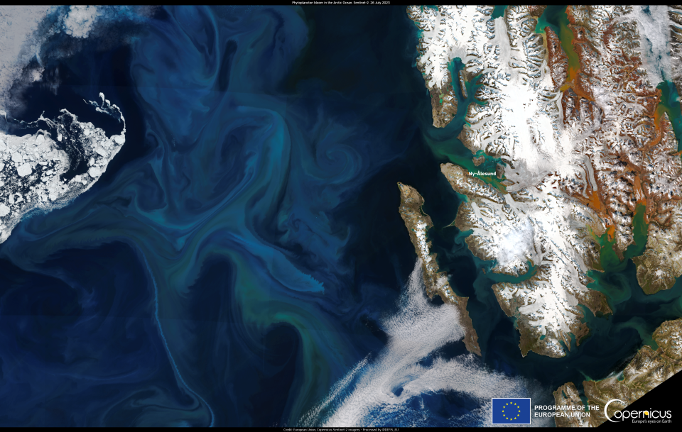
Phytoplankton bloom in the arctic ocean in July 2023
Click here to view at full resolution.
Origins of the guide
While satellite imagery has been available since the 1980s, there have been significant recent additions to the list of available sources of Earth Observation data. Copernicus has ushered in a new era of freely available EO imagery and data. In addition to the Copernicus Sentinel and EUMETSAT satellites (Meteosat and Metop), which provide a bird's-eye view of our planet, there are dedicated Copernicus services that combine remote sensing with in situ data. These services meet users' needs for marine, atmospheric, climate, emergency-related and land data.
Thus, now that we have new and comprehensive data on our planet, we can tell better stories about it. This why EUMETSAT brought together Copernicus data visualisers and communication professionals last year in a series of workshops which then resulted in the creation of a good practice guide.
The series covered the effective strategies for visualising Copernicus data and storytelling tips. It brought together the perspectives of journalists, scientists, data visualisation experts, and remote sensing practitioners from operational agencies and industry. The series introduced attendees to the world of Earth Observation data visualisation and featured testimonials from world-class journalists who use EO imagery to tell powerful stories in their publications.

Article published by the Washington Post using images from the Copernicus Sentinel-2 satellite mission. Newspapers and magazines are using EO imagery to connect with their audiences while telling stories about the state of our planet. Credit: Washington Post
“For me as a journalist and for a very quick turnaround, satellite imagery provides a really valuable opportunity to show the public something they can remember because it’s so visual,” said Kasha Patel, who covers weather, climate change and the environment for the Washington Post, during the workshops.
The workshops also showed participants how to use EO data to communicate to the public about air quality, with a particular focus on using data from the Copernicus Atmosphere Monitoring (CAMS), Marine (CMEMS), Climate (C3S) and Emergency Management (CEMS) Services. Participants also gained a deeper understanding of how to use Copernicus data to tell stories about the oceans, sea ice and climate extremes.
More than 1,500 people attended the sessions and users from all over the world have since viewed the recordings. Representatives from news outlets such as the BBC, The New York Times, Le Monde, Agence France-Presse (AFP) and the Financial Times talked about their use of Copernicus imagery and data, while actors from various institutions such as the European Commission’s Directorate-general Joint Research Centre (JRC) and the USA’s National Oceanic and Atmospheric Administration (NOAA) shared their insights during the workshops. A living resource for EO storytellers The ideas, tips and tricks gathered in the workshops have been summarised in a EO Data Visualisation Good Practice guide. The document summarises the key points made in this series of webinars and provides examples of an effective use of storytelling with satellite data in a variety of contexts.

Journalists Kasha Patel (Washington Post), Gary Dagorn (Le Monde), Jonathan Amos (BBC), Achim Tack and Alexander Epp (Der Spiegel) discuss their use of Copernicus imagery and data in the media outlets they work at during one of the series' workshops in May 2023. Credit: EUMETSAT
The guide starts with an overview of what makes a good environmental story for modern news media, with insights from those who work in traditional newspapers as well as those who tell stories through social media, and plenty of examples to inspire users who wish to tell more stories online.
The guide then explores what data users can look at to build good visualisations - how should users balance robust information with aesthetics? How do users choose the right colours? And how can they make it so engaging that someone will stop scrolling to check the visualisation out? The guide covers all these questions and even includes a 10-point checklist users can check when creating a visualisation.
A handful of examples
To help users understand what a good EO story looks like, the guide collects a wealth of examples of visualisations that users have used to tell stories on a range of environmental topics, from air quality to wildfires to sea ice visualisations.
By scrolling through the "Climate extremes: heatwaves, changes in ice and drought visualisations" collection of examples, users can see how scientists and EO enthusiasts have used different satellite products to raise awareness of climate change issues among online audiences. Examples include data visualisation strategies to tell stories about temperature anomalies, ocean heatwaves, sediment discharge from heavy flooding and more.
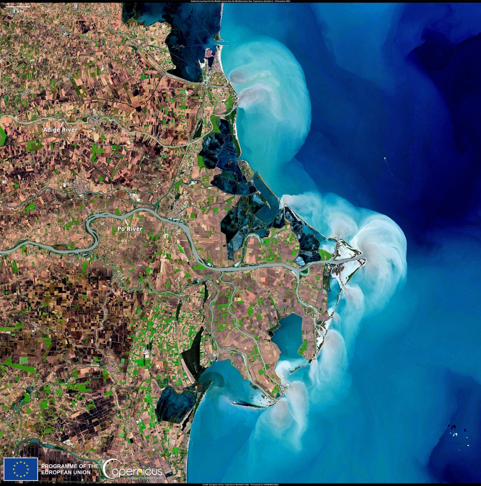
This Copernicus Sentinel-2 image acquired on 4 November, 2023 shows massive amounts of sediment pouring into the Mediterranean Sea from the Angie and Po rivers.
More inspiring examples can be found on the “Air quality and wildfires visualisations” page. One that particularly gained traction in recent years was the satellite visualisation of the lava flow and ash plume from the Cumbre Vieja volcano, back in 2021. Images from space not only amplified the spread of news on the event by providing powerful imagery to accompany the story, but equally helped local authorities manage the consequences of the eruption. In this way, EO-based stories can not only inform and inspire audiences, but also help us take better care of our communities.
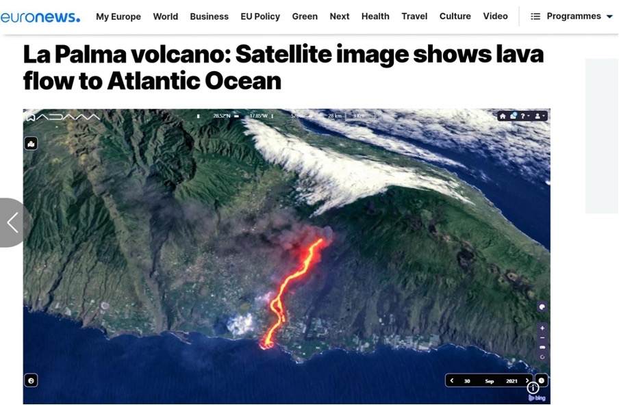
Satellites can provide multiple views of a phenomenon. This visualisation combines both visible and infrared measurements to show lava flow in the context of the surrounding region during the eruption of the Cumbre Vieja volcano in La Palma, 2021. Credit: Euronews
At the end of the guide, users are invited to re-watch the webinars, which are published on EUMETSAT's YouTube channel and review the slides of the presentations made during the workshops, which are all organised by topic and easily accessible. And while the guide is already quite detailed, users should feel free to contribute if they have opinions to share, examples to add, or constructive criticism to offer.
Telling powerful environmental and climate-related stories is critical in an era of misinformation and disinformation on subjects such as climate change, pollution and environmental health. The new EO Data Visualisation Good Practice guide serves not only as a practical resource for users, but also a concreate example of the importance of accurate and engaging communication in addressing global environmental challenges.
Source:
Copernicus. (2024, May 2). Telling meaningful stories with EO data. Copernicus Observer.