Image processing


Principal component analysis
First come the principal components…
When the Earth is seen from on high, the natural landscapes’ ranges of colours are surprisingly limited and there are very few bright colours. Seen from space, the temperate continental areas look green and the vast desert regions’ palettes are dominated by grey, beige, and brown.
This explains why, when the pictures are converted into digital images, the corresponding histograms of the Earth’s surface show little contrast and the spectral components do not vary independently.
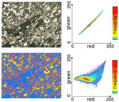
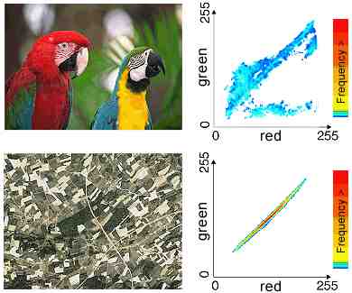
If the red and green components of a digital image are represented in a two-dimensional histogram (scattergram), it immediately becomes clear that remote sensing images (bottom) comprise only a small number of colours compared with a highly coloured photograph of nature (top).
The shape of the remote sensing image’s scattergram (all of the spectral vectors are clustered along the diagonal) reveals a strong correlation between the channels. When a pixel has a high value in the red band, it’s a good bet that it will also have a high value in the green band. This means that the various spectral components add little information to the picture, which could be interpreted practically like a black-and-white picture.
The aim of principal component analysis is to reorganise the data so that they are no longer correlated (that is to say, they become independent). An interesting feature of this transformation, when it is applied to data embracing several spectral bands, is that it concentrates almost all of the information in the first two or three components. The other components generally contain only noise. If only the most significant components are analysed, the volume of data to process can be greatly reduced.
Interpreting the image becomes more complicated, but this technique is very effective in many cases.