Image processing


Colour composite
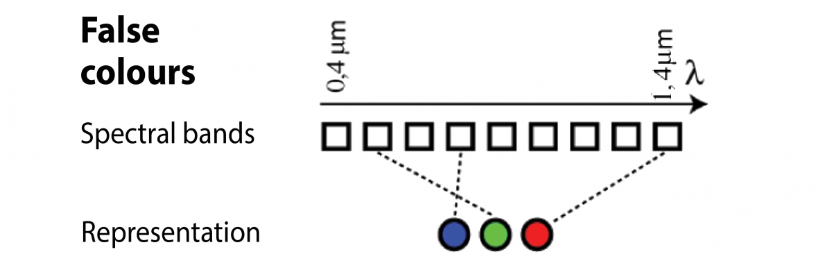
Colours: true or false ?
A digital image recorded by a digital camera is displayed on a computer screen very logically, that is the display system’s red channel is associated with the camera’s red channel, its green channel with the camera’s green channel, and so on. The resulting image is thus a faithful copy of what the direct observer’s eye would have seen: a red-coloured object is shown in red, etc.
We have seen that in remote sensing systems it is possible to detect and record parts of the electromagnetic spectrum that cannot be detected by the naked eye, for example, the infrared band. To visualise this information we pair up display colours (red-green-blue) with spectral bands in the observation system that do not necessary correspond to them. In so doing, we create coloured composites that are sometimes called ‘false colour images’.
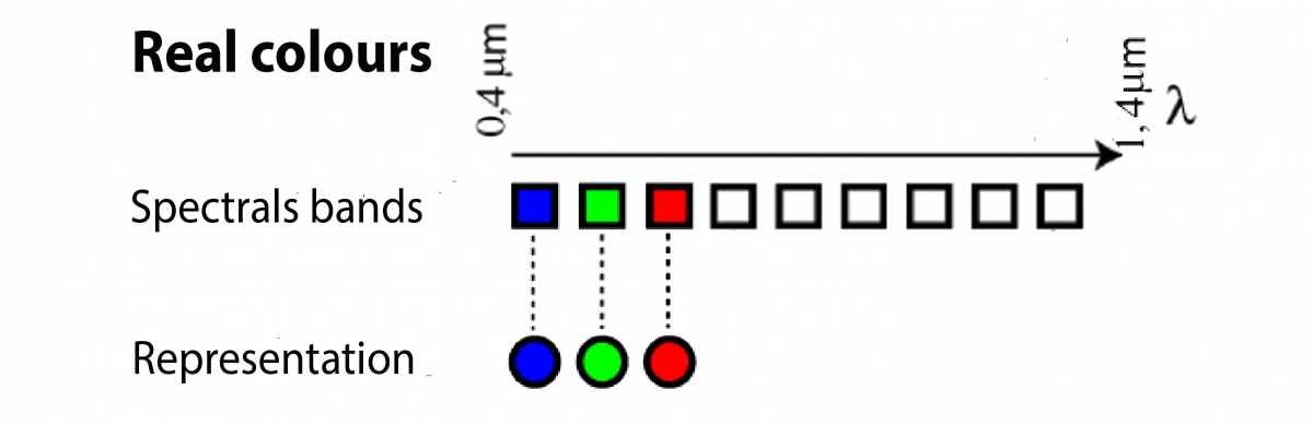
This method is very effective, for it enables one to analyse at a glance three-component data. As stated previously, the red, green, and blue components that define the pixels’ colours in a digital image can be varied from 0 to 255 to generate more than 16 million different colours. The human eye proves to be a powerful analytical tool, for it can compare different objects’ colours but also analyse the colours’ juxtaposition, the objects’ shapes and sizes, etc. These possibilities are the basis of remote sensing image photo-interpretation techniques.
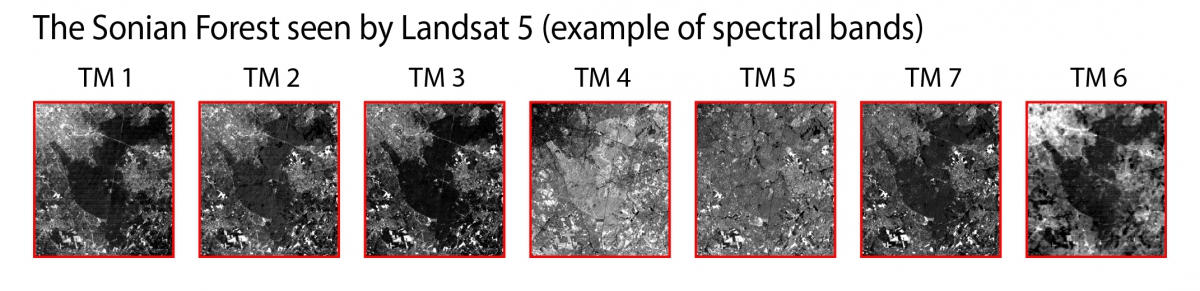
To illustrate some of the numerous composition possibilities offered using the seven spectral bands of the Thematic Mapper sensor, here are three images of south-eastern Brussels and its suburbs. You will recognise the Zoniënbos/Forêt de Soignes and the Terkamerenbos/Bois de la Cambre in the middle of the image and the village of Overijse at the image’s right edge (at mid-height).
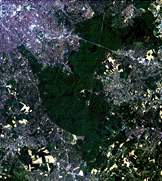
natural colors -TM 321
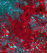
infrared false colors -TM 432
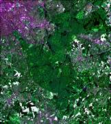
color composite -TM 354
False colour infrared composites are particularly effective for rendering remote sensing data. This technique associates the sensor’s near-infrared, red, and green bands with the colours red, green, and blue on the screen. Such a composition is very effectively for analysing vegetation and offers the advantage of having practically the same properties as the colour infrared photographs with which photo-interpreters have been familiar for years. It uses the particularity of the spectrum reflected by plants, which has a high peak in the near-infrared band. On a false colour infrared image vegetation that has high photosynthetic activity will appear in bright red (near-infrared peak), water will appear practically black (as this material absorbs practically all wavelengths), and mineral surfaces (bare ground, concrete) will show up in hues ranging from blue to white.
It is important to differentiate these coloured composites from another type of image that is used fairly frequently in remote sensing, namely, pseudocolour images. This is a display trick that improves the interpretation of monospectral images (recorded in only one part of the spectrum and displayed in levels of grey). The human eye can identify effectively only a relatively small number of levels of grey in a picture.

In the upper image on the left, the numerical values coded from 0 to 255 correspond to a continuum of greys going from black (=0) to white (=255).
In the bottom image the numerical values are the same, but the grey scale has been replaced by a series of colours covering the entire spectrum. This complicates the overall job of reading the image, but it is incontestably easier to analyse the slight changes in values seen in, for example, the sky and clouds