

IV - FROM DATA TO INFORMATION
4- HOW CAN WE ANALYSE IMAGES AND PRODUCE MAPS?
4.5- How can data be analysed over time?
One of the main advantages of satellite remote sensing is that it provides observations of the Earth at regular intervals. It is therefore possible to study a landscape through different seasons or to follow its evolution over time.
Such "multitemporal" analysis can be performed visually or digitally.
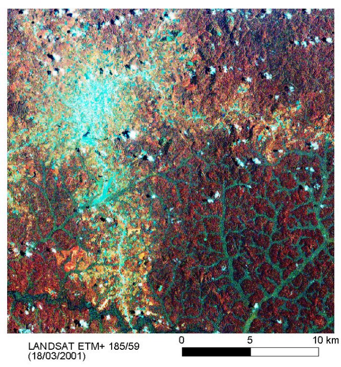
The simplest way is to place two images of different data side by side and compare them on sight. Through certain image processing software and geographical information systems, those two windows can be "synchronised". Moving or zooming in on one of the windows automatically becomes visible in the other. A sketch in one of the windows (e.g. for the extension of a new plot) also appears in both synchronised windows.
|
To visualise a change, however, a new image is often created by merging two images recorded at different times. Such coloured, multitemporal composites then represent surfaces that have changed over the intervening period. This works by applying the principle of additive colour mixing: the human eye interprets the superposition of primary colours (red, green and blue) as new colours.
In the example below, a vegetation index has been calculated from Sentinel-2 images acquired at two different times (12/09/2020 and 26/09/2024) and covering the same forest area located in Bejis, in the province of Castellón in eastern Spain. The first image is then coloured red and the second green.
|
|
|
|
|
|
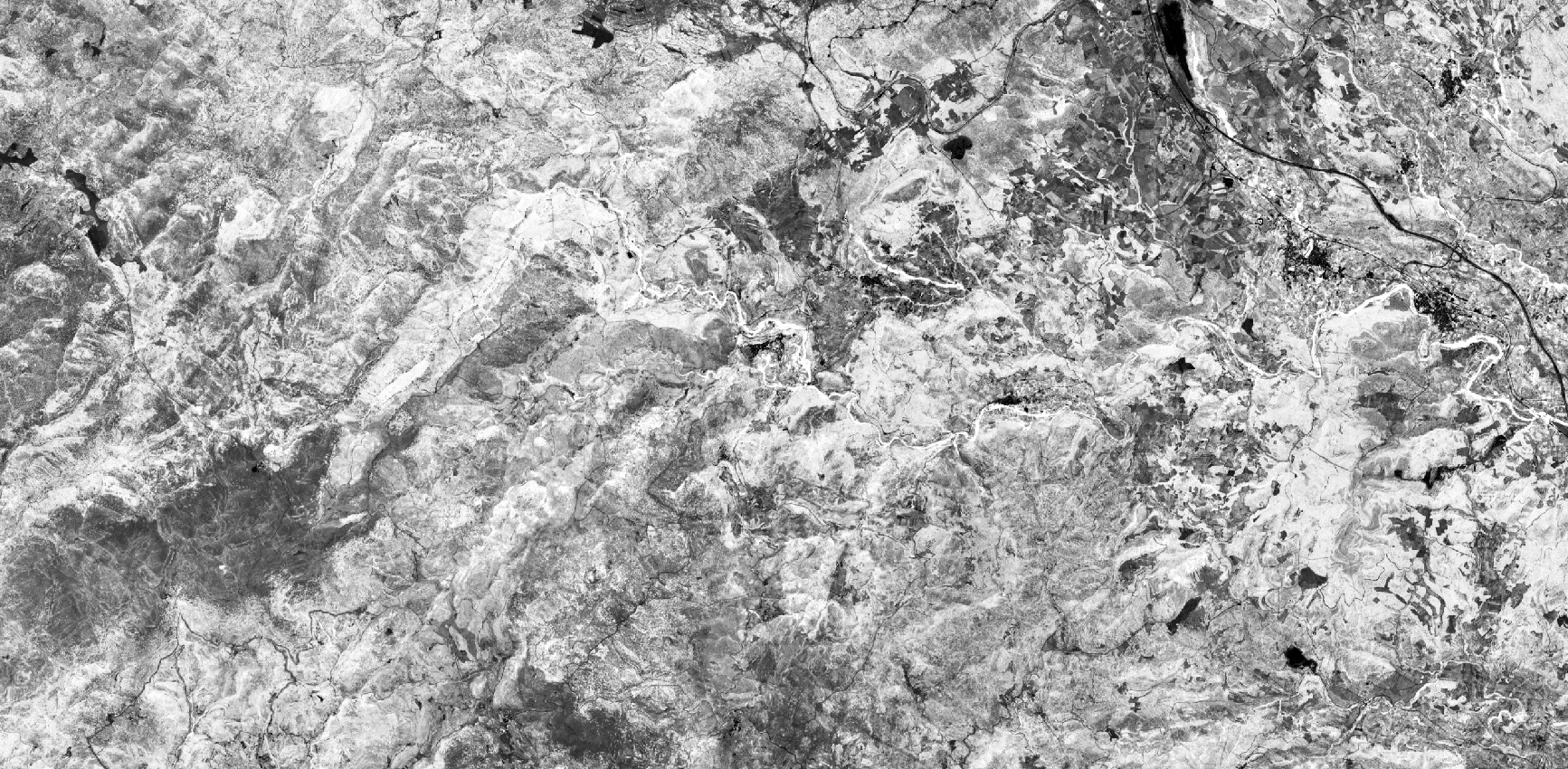
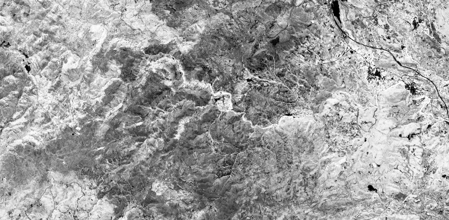


 By superimposing the two images, a new computer-generated image is obtained with tones ranging from red/orange to green, including yellow (a mixture of the two). The colours of the new image reflect the nature and intensity of the change and thus highlight the changes between the two dates. These can be seasonal changes or, as in the case shown here, more radical changes such as the deforestation caused by the major fire that affected the region in August 2022 (see EMSR625: Wildfire in the Valencian Community, Spain). In the case shown, the areas affected by the fire appear in red on the synthetic image
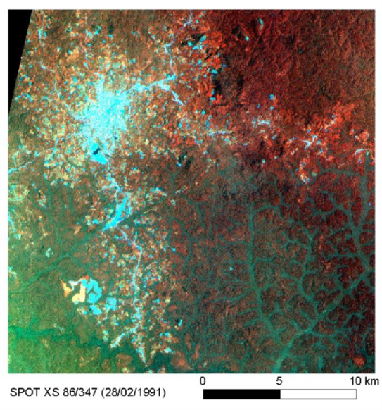
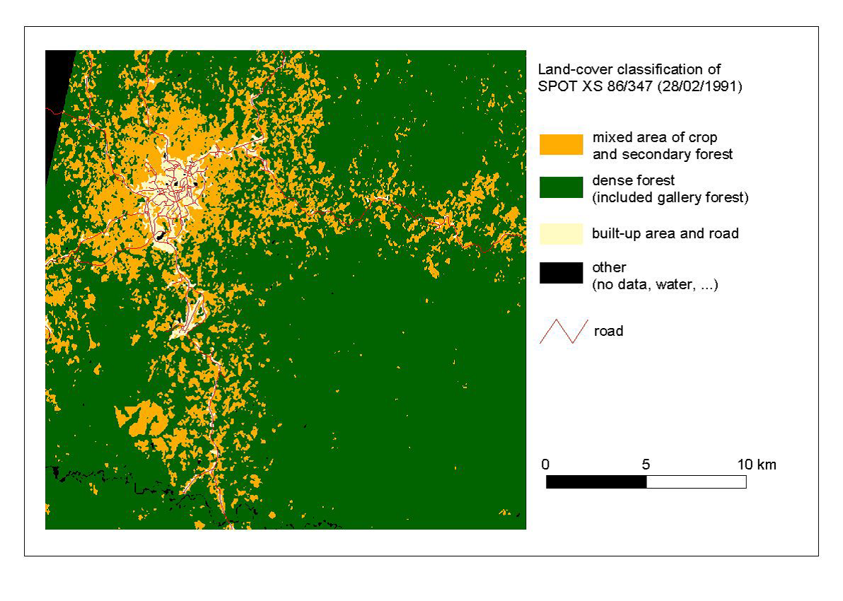
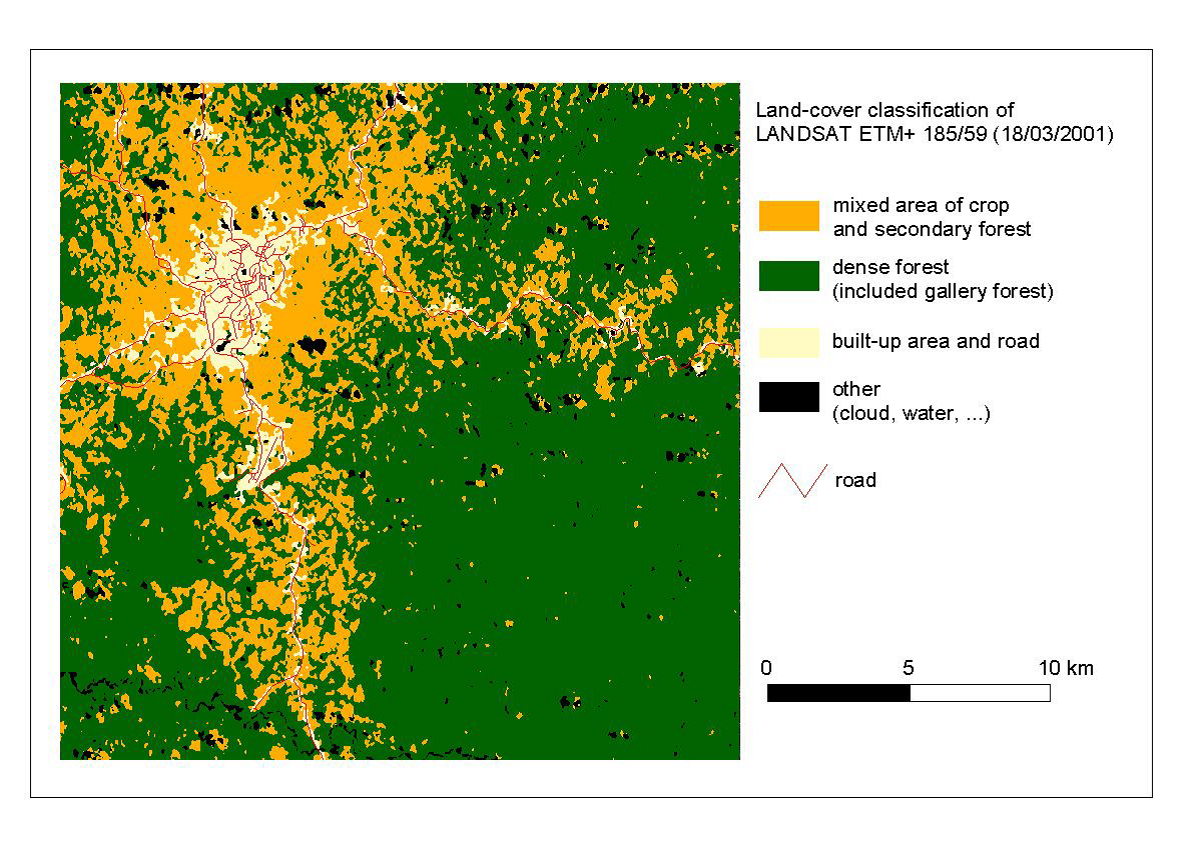
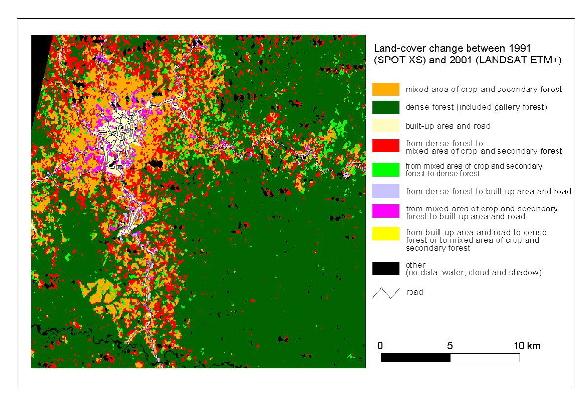
Another change detection technique involves comparing images after they have been classified (see How to classify images/data). The classification is first made separately for both times and then changes are detected by comparing the classes to which the pixels belong at both times. The results are then presented in the form of a new image and with a "matrix of changes". This technique is interesting because it can highlight and quantify the nature of the changes (e.g. area of forest that has become agricultural land).
 |
 |
 |
 |
 |
|
Matrix of changes
Combined cultivation of fodder crops and secondary forest - 1991 |
Dense forest and gallery forest - 1991 |
Buildings and roads - 1991 |
|
Combination of fodder crop cultivation and secondary forest - 2001 |
66 km² |
71 km² |
1 km² |
Dense forest and gallery forest - 2001 |
21 km² |
369 km² |
0,2 km² |
Buildings and roads - 2001 |
10 km² |
3 km² |
13 km² |
If we have not just two images, but much longer time series of satellite images, we can mathematically analyse these time series to identify trends or abrupt changes in them. Abrupt changes in a vegetation index may then indicate, for example, that forest clearing has taken place.
In the figure below, we see three time series of a vegetation index (NDVI) calculated at an area in southwest Ethiopia. The black points on the graph represent the NDVI values calculated from a satellite observation at a given time at the same location. The points follow an undulating pattern over the years (blue trend line) that is the result of the natural, seizonal course of vegetation. For an intact forest, this gradient remains the same (A). Sudden deviations from this trend indicate forest clearing (B) or progressive deforestation (C).
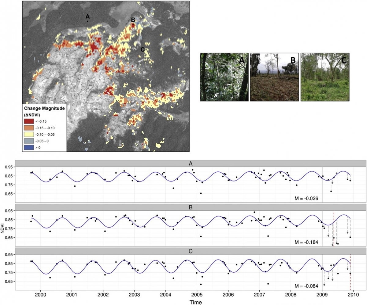
Source: Ben DeVries et al. Robust monitoring of small-scale forest disturbances in a tropical montane forest using Landsat time series. Remote Sensing of Environment, vol. 161, 2015, p. 107-121, ISSN 0034-4257
So there are several methods to do change detection. However, whatever technique we use, it is essential to perform the necessary pre-processing on the images. For instance, we need to ensure that the images are geometrically perfectly superimposed and we also need to take into account variations in lighting and atmospheric conditions, such as the presence of clouds.
